
If you want more information on the Guardian project or my take on different Guardians as well as the project in general, look at my more recent post right here.
Anyway, let's have a little look see at the Army Division, the biggest group of Guardians. I suppose. Again, there's a lot more to come so not all of the pieces are there yet. And, in case you can't tell, I like the Guardian Project. I really do. It just so happens that the top three of my least favorite Guardians are in this group.

I'm starting on a low note. (We'll end on one too.) I do not like several things about the Predator. The first I can excuse, his overall design. The big buck teeth are so distracting. They really are something of an eyesore. But, I have to let that go because the actual logo for the Predators NHL team is essentially that, but it still irks me wrong.
Onward with ridicule. The comic shows him as something of a hick. It's not terrible, but just enough to make him sound like a bumpkin. As an ed-u-ma-cated Southerner, I immediately hate the stereotypcial dumb South idiots. I am not suggesting they aren't out there, nor am I saying they don't make a good living portraying these stereotypes...

Can someone please explain the appeal of the non-useable fishing hook on the cap? In case you've never seen one up close, it's a fishing hook(also called fishin' hook) that is bent at the end to be placed on a cap (lid), kinda like a paper clip.
Anyway, back to the Predator. The story was a little weak, particularly the villian Airwave. He appears to have no abilities, just redneck friends. And his big get away was a private jet. Not like a jet that is shaped like him or a giant symbol of evil, but a Cessna.

Again, not the strongest villian in the graphic novel. His aircraft should be feared by all.

Anyway, I found myself distracted by two things in the novel. One was a lettering error where a word is covered up by the balloon outline. The other was a weird drawing of the Guardian upside down punching a guy. I guess.
I know. I know, it's a minor detail. But it does add a little lumber to the hate fire against this particular Guardian. He could grow on me if he's seen battling harder against a greater enemy.

This is the only Guardian with a god status, though his initial appearance in the graphic novel doesn't show it off. He doesn't appear any more strong than the others. Don't get me wrong, I'll like this character. Really I do. But let's knock him down before building him back up.
First of all, he faces a horrible enemy. Think of a fat Warmachine with a 1970's beard and no helmet. That's a strike, but more against the story than the character. Second, his shield. I don't say this often, but OMG! I hate it. I hate it. I hate it. I do understand the significance of the logo, but I do not excuse it being rotoscoped onto such a regal sheild. I think if it looked more like it was painted on with irovy, black marble and rubies, it would look better and fit the character more.
Now, on to the good stuff.
He rides around on a freaking flying horse. That rocks.

He also has a gemini gladius for a weapon. I dig that. He has a very regal look about him that seems to fit his character and team. Muchos kudos. I also like the gently woven-in story element that the character has a sense of justice given his city of origin is Canada's capital Ottawa. Nice touch.
And let's hear it for Stan Lee! Head Guardian himself who makes a cameo appearance, being abducted by mecha-harpies (think robotic flying monkey rats).

This character is a little difficult for me to describe my feelings about. He surprised me. I want to hate him more than I actually do.
I have to say I am not a fan of his enemy in the graphic novel. It's a pirate that uses all of the stereotypical pirate cliches and lingo. He also has two hook hands.
Seriously.

And his name is Captain Spike. What? He literally sails a pirate ship (The Red Marauder) into Tampa, has an eyepatch and a crew of pirates, and shoots cannons into a convention center holding a gem show. You know what he looks like the more that I think about it?

As a pirate myself, I am offended to be portrayed in such a negative light.
Anyway, so Lightning comes in and saves the day. He's cocky and I'm not a huge fan of cocky people, but I can almost let him get away with it. I don't know why.
I will say he is the only Guardian to get any action in the graphic novel. Some come close and save the girl, but only Lightning plants a lip/lip kiss. And that was with a spectator. The Lightning's story didn't even revolve around saving a girl, she just happen to be one of the lovely ladies to witness the event.
You know who he reminds me of with his cockyness and kiss any girl attitude?

But I kinda like the Lightning more. It's not the hair. I don't like that. I can sorta except it, but it's not great.
Now, the Lightning character may be the first to undergo an image change. You see, the Tampa Bay Lightning NHL team recently unveiled a new design by SME Branding on January 31, 2011.

For the hockey team, I don't like it at all. But, on a superhero, it would look pretty good. Significantly better than the one he currently has (which I understand is not really a choice by the designer). So, will the heros change looks or logos if the team changes looks and logos? What if a team moves or goes under? Will the character be retired? Reborn? Die?
And, if the Guardian Project decides to redesign the Lightning, will he look similar to this only blue?

Only time will tell.

This is a good looking Guardian. One of the things that makes this work for me is the logo. Again, this really isn't the choice of the artists since its the teams primary logo with some exceptions (word marks, like the Capital and Duck are changed). But the B really works here and could have possibly been designed for the character specifically even without a real world influence.
I don't have a lot of critizism against him. Except I do wonder why he mentions saving the bad guy was an accident then lets him go without killing him. Odd. Oh, and I have no idea why he's fighting a snake in that picture. Odd. Again.
Aren't we having fun?
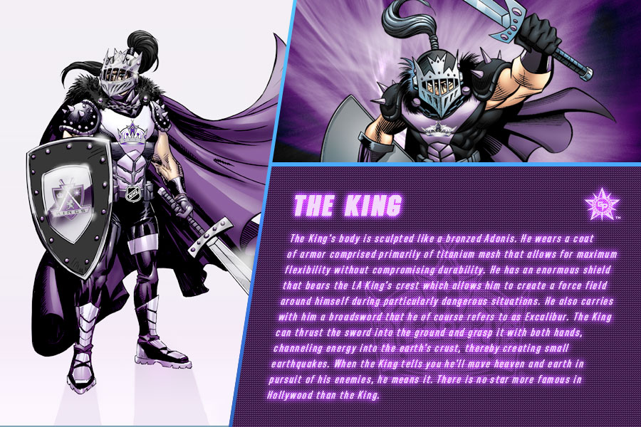
Don't worry. We're over half way home on this post. Next we'll look at the King. I like him. He's simple and effective. I really like the artist's way of using a knight instead of straight up royalty. I can't imagine what autrocity that would be.

Scary.
Anyway, I have to give some props to the story elements again because Chuck Dixon and Tony Chargin show Hollywood celebrities as morons literally under attack and unable to realize it. Odds are the King might not be as busy if his enemy's victims were a little more in touch with reality and stopped problems themselves.
Now, one thing that strikes me as a little odd is a power the King has. He can create an earthquake at will by thrusting his sword in the ground. I get that each Guardian has some influence from their city, but it just seems weird to highlight something that is so devistating.
I know, I know. There are other natural disasters personified with characteristics of that weather (Hurricane, Avalanche, Lightning), but those just don't strike the same cord as the King's earthquake power.
This could be because hurricanes in Carolina aren't unpredicable and aren't quite as devistating. I mean, sure, Katrina was bad, but that was in Louisiana. The worst in Carolina, North or South, was Hurricane Donna. This is one of the most devastating hurricanes to have reached US shores. A full half century ago, it hit the Florida Keys, and then continued on to Fort Myers before landing in North Carolina. It went all the way up to New England before losing strength. More than 50 people were killed in the storm. Bad yes. But even that didn't take a direct bite out of Raleigh.
The worst avalanches on record go back over a century and don't include ones in Colorado, much less Denver. Two avalanches occurred in March 1910 in the Cascade and Selkirk Mountain ranges; On March 1 the Wellington avalanche killed 96 in Washington State. Three days later 62 railroad workers were killed in the Rogers Pass avalanche in British Columbia, Canada.
Now, I can even give a big BIG pass to the Avalanche and Hurricane for having traits like those of deadly disasters because it's their freakin' name! It would be more odd to have a Guardian called the Hurricane whose powers were the power to control plant growth and impregnation of chickens and not control the weather.
Lightning. Now that happens everywhere and is a stereotype for unlikelyhood. Actually, that brings up an interesting stat in that it actually happens more often than one would think. World-wide 10,000 and about 90 in the U.S. each year are killed by lightning. The risk of being killed by lightning is 1 in 28,500. Of the United States, Wyoming has the highest lightning death and casualty rate per capita. So I should probably be more uneasy by the Lightning than the King, but a) it happens everywhere and is not geographically exclusive and b) it's a part of his name.
But back to the King with the earthquake sword. It's not unusual to have deadly earthquakes in LA. Take the Northridge one just outside of Los Angeles, California, on January 17, 1994. Magnitude 6.8; 60 people killed. In addition to killing 60 people, this early morning quake injured more than 7,000 people and left 20,000 homeless. More than 40,000 buildings were damaged in Los Angeles, Ventura, Orange, and San Bernardino counties. Damages were estimated to be in the range of $20 billion.

That wasn't even all that long ago. So am I justified by the weird feeling I get from the King's earthquake move? Maybe. Maybe not. It's just a feeling. But let's not lose sight of the fact that I really do like the King. And Stan Lee's second cameo.

I do not like the Wild.
He has a lot working against him. First of all, his enemy is The Threatener. What does The Threatener look like?

Oh man. I have high hopes as to the villian our next Guardian on this list will face! Who would dare challenge the Shark?

But back to the Wild. I am not a big fan of hairy, beastly characters to begin with. Yes, the Bruin is an exception. One reason the Bruin is an exception is because he looks like a bear with nothing extra. The Wild has a lot of flair, most of which would look misplaced on a human character.
The goggles. The titanium (or whatever) claws. The goggles. The automatic face lift thing is probably the worse. Why? Why is that there? Those ray generators on his hands are odd too. Did I mention the goggles? What is a creature of the wild doing with goggles? You know what he reminds me of?

His story is decent. As mentioned, it is a hard task introducing a character, a problem, abilities, and a resolution in five pages and making it literary brillance.

I will not go into details about my displeasure for this Guardian. Just everything about him is wrong. I mean, he is a person with a shark head. And his villian is a computer nerd. Really. His name in Gigabyte. His plan is to scuba underwater and hack into a cable that supplies San Francisco bank information to another sight. By the way, the NHL Sharks play in San Jose, not San Francisco, so a strike against the story there. Again, I was hoping for a villian more like this...

And I got this...

Plus, the Shark has webbed fingers. And, according to one of his bios, he is quite skilled with computer stuff. How does he type?
There are so many great examples of how smart sharks are suppose to look and act.


And, arguably, these sharks would have been better...

Or even this girl's tattoo.

Let me put things in perspective to further clarify my distaste for this Guardian. All of the other Guardians are very much a personification of the most terrifing elements of their namesake. I would be much more terrified of every single Guardian as compared to their namesake, except for one. Let's do a little test, shall we?
Which is more threatening? A or B?


Okay, that one was easy. A huge monster with an angry smirk compared to a leaf. What about this one?


While both are intense, I still don't want to take on a bear with fists running at me.
Last one. Which is more terrifying?


I really think you failed on this Guardian GME. If you want to win, more villians like this...


Horrifying. Beautiful. Crazy. Evil. Scary. Something like that. I suggest women because it's about the only way to incorporate them in a meaningful way as powerful characters. Even if there are female heros, they would likely be less powerful than the Guardians, so they must be villians. But if you are looking for a powerful, scary male villian, how about...

That rounds out the Army Division of the Guardians. Again, this group has a few that I just really don't like. All of the others I really like, though some have a minut number of flaws I'd correct.
And now I'm going to take a long shower and ponder why I kept thinking of Jersey Shore referrences.


