Sunday, July 31, 2011
Saturday, July 30, 2011
Friday, July 29, 2011
Thursday, July 28, 2011
Wednesday, July 27, 2011
No calls...
Longest Game in Turner Field History 19 innings. A typical game is 9 innings. So yes. We played more than two games worth of baseball in one night.
The game ended at 1:50 a.m. and was the longest in Turner Field history and matched the longest in the major leagues this season. At 6 hours, 39 minutes, it was the longest by time for both teams.
The Braves’ previous longest game by time was 6:10 against the Mets on July 4, 1985, at Atlanta-Fulton County Stadium.
Oh, and I worked for a different department earlier in the day. I arrived at Turner Field about 10:00 and left after 2:20am.
So don't call me. I'm sleeping.
I have no comment on whether or not Lugo was safe at the plate or not. (because he wasn't)

But I still got to go home, so I'll take it.
The game ended at 1:50 a.m. and was the longest in Turner Field history and matched the longest in the major leagues this season. At 6 hours, 39 minutes, it was the longest by time for both teams.
The Braves’ previous longest game by time was 6:10 against the Mets on July 4, 1985, at Atlanta-Fulton County Stadium.
Oh, and I worked for a different department earlier in the day. I arrived at Turner Field about 10:00 and left after 2:20am.
So don't call me. I'm sleeping.
I have no comment on whether or not Lugo was safe at the plate or not. (because he wasn't)

But I still got to go home, so I'll take it.
Tuesday, July 26, 2011
Monday, July 25, 2011
Sunday, July 24, 2011
Saturday, July 23, 2011
Logo's Here, Waiting on the Jerseys
Well, the new Jets logos are in. And I am starting to really like them more and more. I don't know if I'm forcing myself to like it or if I'm actually loving it.
Still no merchandise pictures or ability to order in the States on shop.nhl.com.
But what we are starting to see are some concept arts from our friends at Icethetics. Actually, that's not fair. I don't actually know the guy at Icethetics. He may be very mad at the fact I'm reposting some of the artwork on here. He may really appreciate the shoutout. I don't really know. On my end, I really love that site and highly recommend it. The artists that contribute there have a passion like me, but the actual means to put forth a good looking design.
Icethetics is the aesthetics of hockey. Logos and artwork are property of their respective owners. Concept art featured on Icethetics is licensed under a Creative Commons License.
Anyway, these are five jersey designs from contributors to Icethetics.


By far, my favorite is by Stephen. It reminds me a lot of the Columbus Blue Jackets, but it is distinctively different enough not to be confused. Really slick design.
I kinda like Drew's design too, incorporating more of the red. I don't know how much I'm digging the lower logo on the sleeves nor am I totally sold on the numbers on the front.
The Brian design is decent, but the piping is throwing me off something fierce. I'm not a big fan of all those lines everywhere.
Louie has a nice, clean design that totally works. I've always been a fan of what I call "dipped sleeves" where the end of the sleeves are a different color than the rest of the jersey. Well, generally a fan. I can give an odd look of short sleeves, but I think this design is very good.
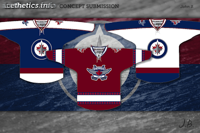
Now, the drawing by John is a nice color combo on the home and away, but that red one is a love/hate. I think I like the look, like the color, like the alternate logo created (the maple plane not in the roundell), but I'm not sold on the maple leaf stamping on the stripe borders. I don't think it works. I also don't think the shoulder patches should be different on the white or blue jerseys. Either one would work, but I don't think they work together on the same jersey.
Again, these are all just concepts by fans. They are not finalists in a design contest or anything. But they are done with a great deal of care and passion for creating something that would look good on the ice, that is clear by all five of these guys (and almost everyone that submits to Icethetics or Puck Drawn, or any number of hockey design sights).
So when can we see an official jersey?
The Jets have promised the new jerseys will be worn by the rookies in some rookie games in early September, but no date has been announced as to their unveiling. So, we must wait some more...
TTFN
Still no merchandise pictures or ability to order in the States on shop.nhl.com.
But what we are starting to see are some concept arts from our friends at Icethetics. Actually, that's not fair. I don't actually know the guy at Icethetics. He may be very mad at the fact I'm reposting some of the artwork on here. He may really appreciate the shoutout. I don't really know. On my end, I really love that site and highly recommend it. The artists that contribute there have a passion like me, but the actual means to put forth a good looking design.
Icethetics is the aesthetics of hockey. Logos and artwork are property of their respective owners. Concept art featured on Icethetics is licensed under a Creative Commons License.
Anyway, these are five jersey designs from contributors to Icethetics.


By far, my favorite is by Stephen. It reminds me a lot of the Columbus Blue Jackets, but it is distinctively different enough not to be confused. Really slick design.
I kinda like Drew's design too, incorporating more of the red. I don't know how much I'm digging the lower logo on the sleeves nor am I totally sold on the numbers on the front.
The Brian design is decent, but the piping is throwing me off something fierce. I'm not a big fan of all those lines everywhere.
Louie has a nice, clean design that totally works. I've always been a fan of what I call "dipped sleeves" where the end of the sleeves are a different color than the rest of the jersey. Well, generally a fan. I can give an odd look of short sleeves, but I think this design is very good.
Now, the drawing by John is a nice color combo on the home and away, but that red one is a love/hate. I think I like the look, like the color, like the alternate logo created (the maple plane not in the roundell), but I'm not sold on the maple leaf stamping on the stripe borders. I don't think it works. I also don't think the shoulder patches should be different on the white or blue jerseys. Either one would work, but I don't think they work together on the same jersey.
Again, these are all just concepts by fans. They are not finalists in a design contest or anything. But they are done with a great deal of care and passion for creating something that would look good on the ice, that is clear by all five of these guys (and almost everyone that submits to Icethetics or Puck Drawn, or any number of hockey design sights).
So when can we see an official jersey?
The Jets have promised the new jerseys will be worn by the rookies in some rookie games in early September, but no date has been announced as to their unveiling. So, we must wait some more...
TTFN
Subscribe to:
Posts (Atom)